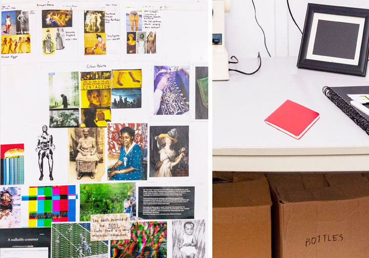
Fig.2 & 3: Table in front of the window with bead embroideries (Photos: Priscilla Kennedy)
In the photo we see the artist's studio; in it, work tools (such as rubber gloves, a sewing machine, rulers), materials to stimulate the artistic process (e.g. image sources, sketchbooks, materials) and artistic work results. The room is painted white, even the crumbling block in the right-hand corner. This echoes the idea of the "white cube" with neutral walls as a currently still valid basic model for exhibition spaces of contemporary art. Everything is very clean and tidy. On the three tables in the room, materials and tools are arranged like in a still life. For example, on the table in front of the (curtained) window, an arrangement showing, among other things, a round embroidery frame with a bead embroidery that is not yet finished: work in progress. Everything is obviously deliberately placed in this museum-like working space, which thus develops a programmatic expressiveness.

Fig. 4 & 5: Print outs on the wall, red book (Photos: Priscilla Kennedy)
Fabrics, textiles play a major role in this scenario. They are simply material (the kente fabrics on the right) or supports for the two larger works (also on the right). But they also play a major role in the many pictures (DIN A 4 printouts on the left wall), now as depicted clothing: women's dresses in older prints, on works of art (from ancient Egypt) to more recent photographs. Surprisingly, there are images of the vestments of Catholic priests and, beyond that, abstract fabric patterns, ornaments. Working with fabric (which also includes the embroidery frame) is repeatedly found as an important field of work for feminist-oriented artists or for a feminist-oriented visual language in contemporary art.
The DIN A 4 printouts are partly annotated in writing, which reinforces the impression that we are dealing with a "picture atlas" in the sense of Aby Warburg or an "atlas" in the sense of Gerhard Richter, i.e. an often surprising compilation of pictures which in this combination can or should provide very systematic suggestions for pictorial design and for reflecting on contexts.
This also includes the other collections of pictures in the room, in the photo album, on the computer or in transparent sleeves (on the right-hand table), which are obviously often biographically oriented, for example through the baby and children's photos, or through images of their own artistic works.
The overall picture is thus dominated by central aspects of current "global art", an art that could just as easily be shown in Berlin or New York. In this one, however, site-specific aspects, i.e. aspects related to Kumasi, Ghana or West Africa, emerge again and again: the kente fabrics, the photos in the album, even the materiality and construction of the walls speak of the place of origin.

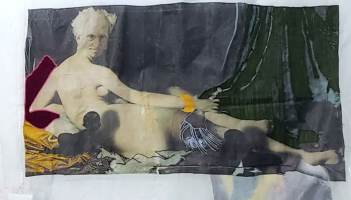
Fig.6: Priscilla Kennedy, o.T., experimental study (courtesy the artist)
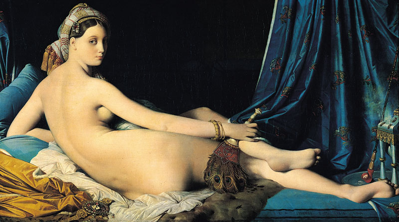
This coming together of different thematic layers becomes clear once again in a detail, the painting that the artist presents in her studio on the right wall and which she herself sees as a technical experiment (see illustration below).[1] It shows an adaptation of Ingres' painting "Great Odalisque" from 1814, now in the Louvre. The superimposed head of an older white man (Arthur Schopenhauer) is reminiscent of the same pictorial strategy that the Guerilla Girls successfully tried out with the odalisque in 1989 by putting a gorilla head on it ("Do women have to get naked to get into the Met. Museum?"). While the other elements of the work vary the forms from Ingres' painting, mainly in colour and technique, there is one crucial addition in this work: a small baby in silhouette, black, looking up at Schopenhauer and casting a shadow on the pale odalisque body. The whole thing is printed or embroidered on a transparent, light fabric that throws folds.

Fig. Ingres, The Great Odalisque, oil on canvas, 1814, Louvre (Copyright CC)
These references make the picture seem familiar to Europeans, but in its combinatorics and with the harsh contrasts it is enigmatic, just like Kennedy's studio itself. Here, an icon of Western art is cheekily alienated, here the canvas becomes a thin nettle, here the woman becomes a man, the soft cushion becomes a hard wedge, the white woman gets a black baby. On the one hand, objects and their meanings are thus unambiguously designated and named, but at the same time, through the artistic formulation and its combination, they are placed in an enigmatic resonance space, which immediately eludes the unambiguous settings that have just been made. An "in-between space" between black and white skin colour, man and woman, opaque and transparent, old man and young child, European (old) art and West African (young) art.
If one looks back through this image (which is taken here - against the artist's intention - as a key image) to the studio, one finds very similar constellations there: empty chasubles of Catholic, i.e. male priests against female bodies in erotically charged clothing, falling, soft fabrics against rigid measuring instruments from geometry lessons, physicality against abstract patterns and ornaments. With such contradictions Kennedy creates an experimental constellation, she spans a field that reports on possibilities in between without letting them culminate in a final work. The open, unfinished field of experimentation thus becomes the actual "work".
[1] "This work does not have a title. I considered it as an experiment to try printing with a blend of embroidery. What is actually piercing through from the back is also part of the experimental process where I made heat transfers again behind the fabric to see the interplay of images from various directions of the material. I do not consider it as a work but as an experiment. " (Information from Kennedy to the author via email on 5.10.2022)


